Branding Basics 01
Hello! It was a huge jump when I decided to make things professional and build my brand. I was getting a few gigs with Instagram dms and I felt comfortable with barters. I began to think my gear is what frames my identity.
Then reached a point where I knew my quality of work doesn’t have a tag of gear to it. I didn’t need to tell anyone that I use a free video editing app or an only Lightroom Mobile app for creating my final content.
But then, there also came a point when I realised that quality doesn’t always mean quality of photos. Transforming into a brand, with a workflow, brand kit, marketing tools and confidence is what turned tables for me!
Let me walk you through the basics of building your own brand! You’ll see it for yourself how it changes the way your clients look at the same work produced.
Creating a Brand Kit
Above, is a mock up of a Brand Kit and creating your own will already shape your brand to look like a professional one. A brand kit / brand assets will usually comprise of the fonts, logos, colors and general look that defines your brand across all platforms, digitally and physically. There could be a lot more assets to a brand depending on the scale of the business.
But generally for the starters this should give the viewer/client a picture of your brand. With several digital mediums today, I prefer Canva for creating my Brand Assets. It not only helps create your brand assets with ease but also helps with a ton of templates that you can choose from to make things easy for your content building. #notsponsored
Logo Basics
Visual Element
Brand Name
Brand Vision / Tagline
Make your Logo stand out
Your logo is the what connects you the most with the audience. Create a logo that is simple, easy to memorise and speaks about you.
For example, my logo comprises of 2 elements, my brand name along with what it stands for and a sliced pomegranate because my viewers connect and I connect the most to my pomegranate photos. It means something to me and it allows my audience to go back to the memories of my pomegranate photos.
Canva allows you to create your Logos easily with so many templates that you can customise to make your logo unique and save it to the brand kit in many available formats.
Other Assets
Some other important assets for your brand are the fonts, colours and website.
Having simple-to-read fonts with a unique style can add value to the brand outlook. A few stylised handwritten fonts for headings and titles can draw attention to the viewers eyes. Also having a simple mix of serif and san serif can help create variations yet keeping the look classic.
Colors bring life to your brand. While choosing colors know where the application of these colours would be (eg. Website, PDFs, Media Kits, Price Sheet, newsletters) Choosing a specific colour palette will help create a cohesive look to your brand which intern helps the viewer connect to your content efficiently.
Website
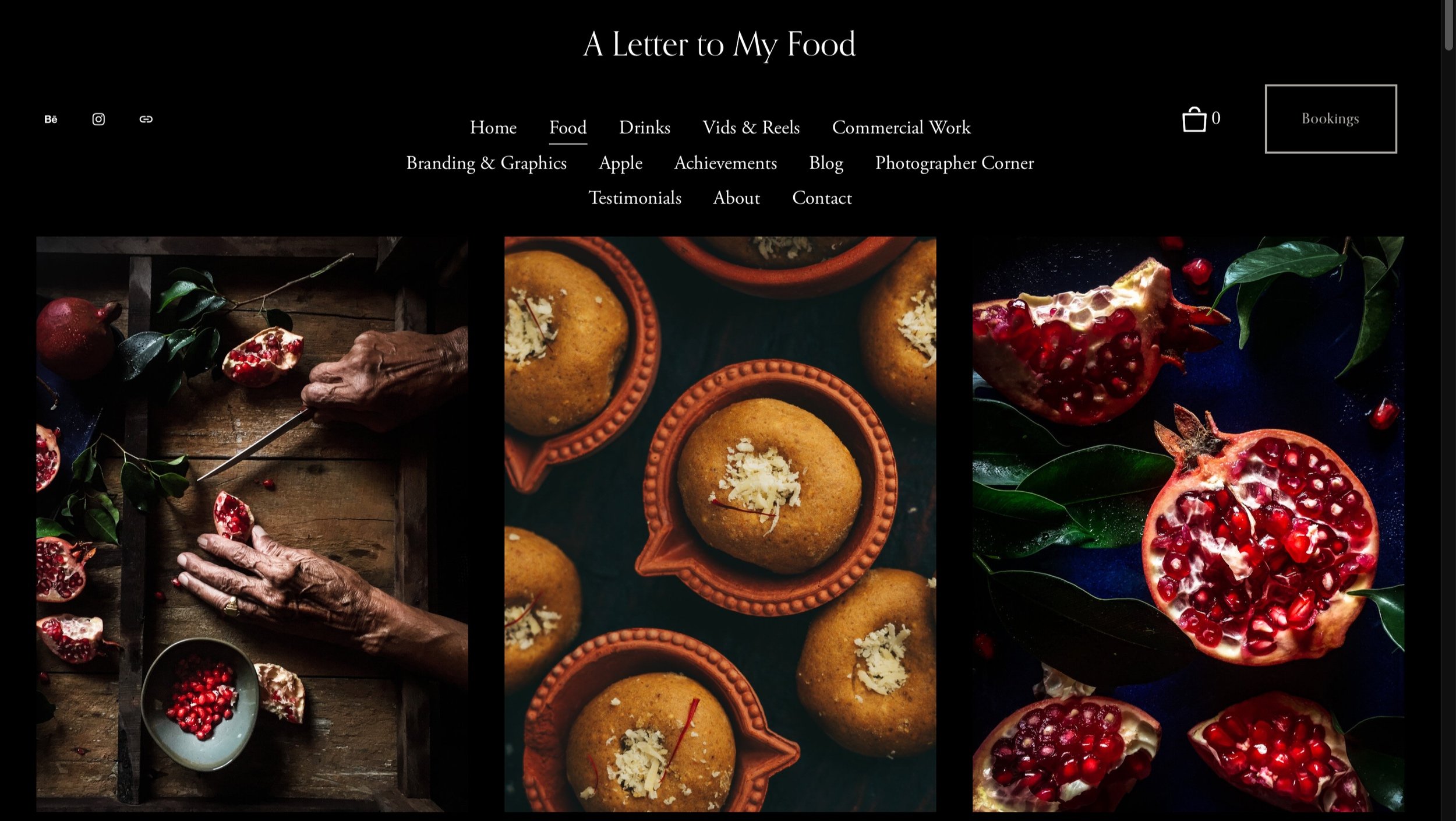
This is one is what makes all the difference! Having a website simply means your craft is professional and it is a space away from social media where you have your personalised work, in your custom web design that speaks all about you and your craft. Having my website gained me quality clients because it shaped my craft as a brand to the clients.
A website is so simple to create today with amazing hosts to choose from. I swear by Squarespace for its easy-to-use designs, award winning templates, great customer support.
You can also create your simple website on Adobe Portfolio that comes along with Behance subscription.
Having your custom email id makes you look absolutely professional. Brands always like to invest in brands over freelancers. (Studies say so!)
Media Kit
A media kit describes your brand in 3 pages.
The first page talks about you, your craft, your achievements, and what you can offer to your clients.
The second page talks about examples of your work, for example, image thumbnails of commercial lifestyle shots, E-commerce photo thumbnails, links to your video content, etc. This gives your client a brief idea of your work aesthetic and what to expect.
The third page is a brief on your pricing and what formats and where you will be sharing your final content with your clients. Pricing details must be clear with creative charges, license fees, pre production costs, post production charges (if any).
Having laid these out clearly in your media kit avoids confusion at later stages of your project with your client. A media kit is a point of reference for the client.
I would be sharing Media Kit templates with you super soon so you can make the most of your branding.
I hope this blogpost has gotten you thinking and will help you transform your photography craft to a professional brand. For those of you who feel stuck and don’t know where to begin, this guide hopefully gives you direction. Take the process slow, and make sure you reflect your personality on your brand.
It could feel like the next big leap for you as a creative, and trust me, it’s so worth it!
All along, i’m a comment / email / dm away for any questions! Im happy to help with all the knowledge I have for you!
That’s it for this post! Hope your creative brain is churning with ideas now and i’m excited to see you transform!
Do pass along this post if you think someone could benefit from it! It means the world to me!
Happy creating! Until next time, bye!


